Main Stuff[]
We are holding a contest to collect fanart of TFFM. Here's how it's gonna go.
Every 3 days, 3 characters will be picked for people to draw. When you're done, simply insert it into the gallery. Then, by the end of the 3 days, the fanart will be judged by the TFFM Staff and the winner gets a free character pose from me!
Rules[]
- NO ART THEFT! If you steal art, you are disqualified from ALL contests.
- Put your characters all in one picture. If you don't, we'll have to slap em all into one.
- Don't insult others' artwork.
- No vandalising!
- One artwork per person.
Top Tips []
- TFFM Assets is useful as it provides bodies for each character.
- This page and this page both brovide limbs and facial features! Use them!
- If your going to use assets, its advised you use PowerPoint or paint.net. However, we accept any type of art!
- The more your characters interact, the better!
- Backgrounds also make your pictures look better, but I'd save myself the work of making one and just use one from the internet
Contest 1 (19/05/18 - 22/05/18)[]
Characters[]
This week's characters are Ay Doot, Onion,Coal and hitler the botanic manics and the brain chomper! Hmm... Plants and Zombies? Seems familiar...
Gallery[]
Results[]
We got 3 pieces of fanart in this first competition! The judges will be SarancthaTFFM, ShadowTFFM CheecH27 and Lunchablez, meaning you get a score out of 40. Lets go!
Art 1 - Memekai[]
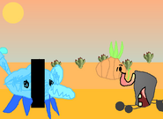
SarancthaTFFM - I really like the background on this one, plus I like how the characters interact, like how Stunion is licking Coal's dead body. 8/10!
ShadowTFFM - 5/10. Paint and assets aren't too good. The logic doesn't work either.
CheecH27 - The background is decently drawn, though they could have separately drawn the cacti. Ay Doot and Onion are interacting, with Coal sorta laying there dead. I'd say 7 for the first one.
Lunchablez - I can see whats going on clearly and it's drawn good I guess. I give it a 7.
That makes it a 27/40 for Memekai.
Art 2 - Nahuel[]
SarancthaTFFM - I like how well the characters are drawn, but they don't seem to interact much, maybe except Ay Doot and Coal. I'll give it a 6/10.
ShadowTFFM - 6/10. Ay Doot is weird, Coal is too smooth, extra points for great Onion.
CheecH27 - There's no background, but the drawings are quite good, although Ay Doot is a bit mis-shaped, I'd give it around a 5.
Lunchablez - There isn't a background, but I love how Onion is drawn! Also, I don't find it very obvious what Ay Doot's doing, I guess he's just dooting at Coal? I give it a 6.
So, Nahuel gets a 23/40.
Art 3 - Wikilydia[]
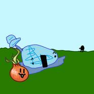
SarancthaTFFM - I like how the characters are drawn, especially Onion's cute widdle face dat I wanna nibble up so bad, and I can understand why you didn't add a full Coal considering his assets are really hard to use. However, Ay Doot's mouth is a bit off. If you want to make him look better, use a real rectangle. Overall, I give it a 9/10!
ShadowTFFM - 7/10. Assets used but to an extent, great Plants VS Zombies take.
CheecH27 - Onion and Ay Doot have lots of expression but making Coal far away is kinda taking the easy way out. The background is lacking too. 6 outta 10.
Lunchablez - Onion and Ay Doot are next to eachother and are drawn quite well. Coal tho? He's just in the background. The background is just a green slab aswell. I give it a 7.
Overall, thats a 29/40 for Wikilydia!
Winner[]
Out of all of these wonderful pieces of art, 3rd was Nahuel, which I find surprising because it seems to be the only one drawn in Paint.Net (the software I use).
Next comes Memekai in 2nd. I think this one ranked so high because the characters were really interacting well. Take this as a note for any next competitions!
Finally, with a monstrous 29/40 score, Wikilydia wins 1st place! I think the judges really likes the expression and the use of assets, even if Coal wasn't really all there. So, Wikilydia, message me with the character you'd a pose made of, and I wish the best of luck to you all in the next contest!
Contest 2 (23/05/18 - 25/05/18)[]
Characters[]
This week's characters are Pills, Marmite and Shadow. The Chilled, the Crude and the Creepy. See? Alliteration!
Gallery[]
Results[]
We got 4 pieces of art this time! A new record! Also, I'll be the only judge this time, so you get a score out of 10. Lego!
Art 1 - Nahuel[]
This art is truly great! I love the expressions on the characters face, as well as the creepy background, and this piece even tells a story too! Assets were also used in this piece of art, which I'm a big fan of. 10/10, awesome work!
Art 2 - Memekai[]
This art is good. I like the funny expressions on Pills face, plus the way that the pills in Pills are a substitute for blood, along with Marmite's marmite. However, I don't really understand the reason that shadow is shaped like that, and the shading makes it hard to understand what's happening at the top. Plus, its hard to understand this piece without the lengthy explanation you gave. I'll give it a 6/10. Not too bad.
Art 3 - Wikilydia[]
This art is okay, I guess. The expressions are cute, but the characters aren't interacting at all. Also, there seems to be a bit of wasted space at the top of the screen, Overall, I'll give it a 6/10.
Art 4 - Autismotron[]
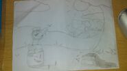
Wow. I didn't think that anyone would actually draw any fanart on paper. I really love this piece. First, the background is great. I like the tiny forest in the background an the big tree that puts a bit of shade on Shadow. Next, the characters. They look really good, and Marmite is really funny. I never considered how similair he is to a frog with his big tongue. Then, Shadow seems to be alot more playful and tame in this piece compared to others, which really is how I visioned it acting in the first place. However, I need to take away 2 marks. 1, for not colouring it, and 2, for not digitising it. If you did those, this would've definetely won. So, 8/10.
Winner[]
Out of the 4, we had a joint third, between Memekai and Wikilydia. For Memekai, I advise that you try and make your story more obvious in the piece rather than explaining it in a paragraph. As for Wikilydia, work on your interactions.
Next, Autismotron comes second with his amazing piece of art. All i can say is that you would've won if you digitised it.
Finally, with his amazing work, Nahuel wins. You got 10/10! Amazing! So, message me the character you'd like me to recreate, and best of luck to all of you next contest!
Contest 3 (26/05/18 - 28/05/18)[]
Characters[]
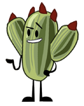
This week's characters are Triangle, Magnet and Cactus. The unbeatable trio of brains!
Gallery[]
Results[]
We got 4 people again this time. The scores will be out of 20 because me and TFFMShadow will be judging.
Art 1 - Nahuel[]
SarancthaTFFM - I'll say a 9/10. The idea's really funny, the background and facial expressions are really nice and it honestly made me laugh! THe only mark taken off is for really nitpicky stuff like how Cactus is a bit stretched.
TFFMShadow - 8/10 because the idea is pretty comical, the bodies are already made ones I think, and the background mixes well.
So, a 17/20 for Nahuel. Not bad!
Art 2 - Memekai[]
SarancthaTFFM - I'll give it a 5... The idea and efforts there, but its really really hard to tell whats going on without a description (yet again) and most importantly, theres characters and text everywhere which really distracts from the main image. It's still drawn good, I guess.
TFFMShadow - 1/10 because I just can't tell the idea? The bodies and background look bad, I'm pretty sure I've seen that Pills before, too.
6/20 for Memekai. Less than half way, yeesh...
Art 3 - Autismotron[]
SarancthaTFFM - Really good! I like the story that's being told, and its drawn really well! Although I have some major problems with Cactus' colouring and the background seems a bit iffy to me, I don't know why. I'll give it an 8/10!
TFFMShadow - 7/10 because the background is well done but small shading and detail. Bodies are good but don't like the ahegao face.
Thats a 15/20 for Autismotron! Thats a good score right there!
Art 4 - Wikilydia[]
SarancthaTFFM - HNNNNNG TRIANGLE LOOKS SO CUUUUUTE! The background is pretty bland and, once again, theres alot of wasted space around the edges. However, I'm starting to suspect that this might just be down to the drawing software you use, since it happens every time. I wouldn't say that the characters are interacting, but you can see that they're trying to convey some emotion. I'll give it uhhhhh 6.
TFFMShadow - Boring and plain, but 6/10. The expressions are managed well although they are small.
12/10 for Wikilydia. Thats alright.
Winner[]
Out of the 4 artworks, Memekai got last with a measly 6/10. Next time, I think it'd be better for you to stick to just the 3 characters shown. And, yet again, show, don't tell! Instead of writing a long paragraph in your picture, make it more obvious what the story's supposed to be, even if you have to use dialogue!
3rd is Wikilydia, with an average 12/20. I'd say to try and spice up your pictures more, maybe with a couple extra details in the background, and remember to work on your interaction too!
2nd is Autismotron, with a really good 15! I'd say to work on your colouring, because for some reason, it seems extremely off and I don't know what's causing it. I think it's the sky, I'm not sure. Or maybe the outlines.
1st, again, is Nahuel, with an astonishing 17/20! The only things i could say are wrong are tiny details like cactus looking a bit elongated.
Contest 4 (29/05/18 - 31/05/18)[]
Characters[]
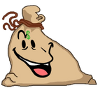
The characters for this time is the iconic trio of Tomato, Hivey and Moneybags!
Gallery[]
Results[]
We got 3 pieces of art this time, guys! I'll be the only judge because the staff is sorta lazy. So, without further ado, lets get judging!
Art 1 - Nahuel[]
Thic one seems sorta cute, to be honest. The expressions look nice, but I'm confused on why you only used Hivey's asset. It makes the others look sorta weird, Tomato looks too round and big, and Moneybags is too blobby. . The simplistic, gradient background makes the art look good and the characters really stand out. Also, I like how you used Moneybags having no arms to make a joke. I'll give it a 7.
Art 2 - Memekai[]
Wait WHAT THIS ACTUALLY MADE ME LAUGH LIKE WHAT THE HELL. First off, the expressions are so funny! I'm pretty sure you got them from Assets & Weird Faces, but they fit really well! Also, I'm happy you used assets because they really make the artwork look better and more accurate. The story is really funny too, though I'm not sure why Tomato is holding an axe. I think its a Kirby reference though, referencing Whispy Woods. Finally, the simplistic background looks really nice! I think it's because you used gradients for them, but they look really stylistic and good. 9/10!
Art 3 - Wikilydia[]
I like the cameo of one of your characters because it sort of makes sense. I like how you used the bodies, but the expressions are sort of bland (besides Blender). Also, Hivey's face is on the wrong side of her head. The background also is still sorta bland. 6/10.
Winner[]
In last place is Wikilydia. I don't really have anything to say, my criticisms are mostly the same every time.
In second is Nahuel. I guess I should say that if you're gonna use assets, use assets for everyone, not just one character. If you don't it seems inconsistent.
Finally, the winner is Memekai, with a really good piece of work, despite being rushed. So, with best of luck for next contest, come to me for your prize!
Contest 5 (1/06/18 - 30/06/18) (was delayed)[]
Characters[]
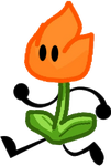
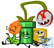
The characters are Fire Flower, Pirhana Plant Pipe and Question Block, the retro riffraff!
Gallery[]
Results[]
We got 3 pieces of art this time, again. I hope more of you can be motivated to do art. The 3 judges this time are me, Shadow and special guest, Budgt!
Art 1 - Nahuel[]
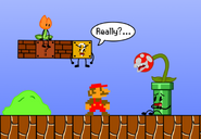
Saranctha - I LOVE THIS HNNNG I love the Mario Theme, I like how all the characters fit into place, I EVEN LIKE HOW THE PIRHANA PLANT'S FACE LOOKS WHY DO I LIKE IT SO MUCH AAAA? 9/10
Shadow - 8/10 - This is amazing, honestly for reasons people might not at first realize. The background is almost spot on with the real mario games. The blocks in the sky, the placing, all of it is perfect. The positions, too.
Budgt -this right here is some good art. i personally would say that the placing and sizing should have been done differently, but it's really good nonetheless. i give it a 6/10
And that comes out asa good ol 23/30! WOWZER!
Art 2 - Memekai[]
Saranctha - This is sorta like the picture you made for challenge 3, but somehow... even worse? It's in a very confusing landsape, the story and interactions... there... but it's not good, and finlly, AGAIN, its cluttered with unneeded characters. 2/10
Shadow - 1/10. No, effort, at, all. Don't you dare try argue "OH I DID TRY, ITS HARD ON MY OWN OK" or "I THINK ITS PRETTY GOOD BECAUSE". I don't care, honestly. It's bad. No details, everything is crappily made, adding more characters and complicating things won't improve your score. If you don't mind could you explain this to me in the chat? I really don't get this abomination. But don't give up drawing just because this is bad. Keep going, you might be good in the future.
Budgt - i think you could've and should've put more effort into this one. images are crudely cut and pasted (e.g the dry bones hat, enemies in the background, pirahna plant), the drawing isn't too good either (e.g limbs are too big) so i'm gonna give this a 1/10
4/30 oh nooooo.
Art 3 - TSRITW[]
Saranctha - 2/10. The most effort I can see in this picture was putting the floor, adn even that couldnt have took long. I can tell this is literally just a message to get you unblocked.
Shadow - 0/10. You literally just copy and pasted the three images of the characters and no effort was put into this. This is simply a message to unblock you.
Budgt - 1/10 - you copied and then pasted three characters from the show. after that you drew some lines, filled it in with grey and blue and then typed "UNBLOCK ME". it's just a message to try to get unblocked which isn't going to happen.
3/30 is lower than the grades i get in school.
Winner[]
Coming in last is TSRITW. Can't really crtiticise him sicne hes not actually here. But he got a 3/30.
Barely scratching last place with a 4/30 is Memekai. Again, stop cluttering you art with unnecessary details and characters, as well as a bare-bones story.
Coming in firsat, with a whopping 23/30, is Nahuel! Once again, really good art! Just tell me what you want me to make.
Contest 6 (1/07/18 - 7/07/18)[]
Characters[]
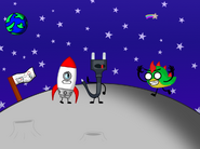
This week's characters are Rocket, Plug, and Fred! Think of space, Rockets an astronaut, and Fred's an alien!
Gallery[]
Results[]
We got 3 pieces of art this time, nice! I'm the only judge this time, but I have some important news at the end of this contest.
Art 1 - Nahuel[]
This one looks nice! I like the character expressionss, however, i feel that the back- wait, I just remembered! I CAN'T JUDGE THIS ONE! NAHUEL LEFT! Umh, he shall be excused.
Art 2 - Memekai[]
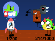
I like this one! The characters look accurate with nice expressions, and I like the idea of them having a weightlifting contest, and I guess it also ties into science with how Fred's more suited to different envi-you get the point. To improve, I think it would be better if you improved the space part of the background with some pretty stars!
Have yourself a 7/10!
Art 3 - Wikilydia[]
Aww, this ones cute! They look like a little team, and I really like that! However, I must say, there's ALOT of wasted space on the left. I would've moved the 3 characters a bit to the left.
6/10.
Winner[]
With a 6/10, is Wikilydia! I hop that next time you can win, because I can see you're heavily improving!
And with a 7/10, an inch away from being last, is Memekai! Really good work this time!
Announcement[]
Because of general disinterest in doing this anymore, I'm passing over this series to Memekai. I will still be judging some times, making rewards, and coming up with characters to draw sometimes. I hope this doesnt discourage people from doing this competition though.
Contest 7 (7/25/18-7/28/18)[]
Characters[]
Yes, I am changing it back to three days. But the contest? Let's just say: CONTESTANTS WHO WERE GOING TO DO SEASON 1 BUT NOW LATER!


